
you are at the paint store looking at the hundreds of options for painting your interiors. you are tired of those brown walls…white walls…gray walls….yellow walls…blue walls….why does your neighbor’s home look so much better? you leave more confused than ever. how do you pick the perfect color?
begin by analyzing the natural light. what is the home’s orientation to the sun? does your flooring absorb the light…reflect the light? do you want your furniture to contrast or blend with the walls? you can manipulate your space and cause furnishings and art work to recede or advance depending upon the background colors.
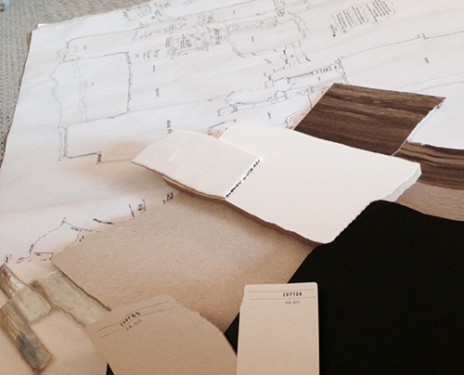
a designer trick is to use a monochromatic color palette by beginning with one color and then lightening or darkening that particular shade. if you have a favorite art piece, pick a bold color from it and use that color in solid pops of color for pillows, drapery, area rugs, throws and accessories.
shades of white and off-white is the emerging trend for 2016. don’t think of hospital white, the whites from sherwin williams, benjamin moore, glidden and dunn edwards are creamy without being sterile. paired with warm or cool tones you will find you can make a visually interesting, warm and welcoming space.